If you’ve ever added custom functions to your functions.php file—only to find them gone after a few weeks—it’s likely because your parent theme (like Astra) was updated. WordPress themes often reset modified files during updates, which can cause your hard work to disappear. The solution? Use a Child Theme.
Why Your Code Disappears
When you add code directly to the parent theme’s functions.php, that file gets overwritten whenever the theme is updated—whether automatically or manually. If your carefully built features suddenly vanish, it’s time to switch to a Child Theme setup.
What is a Child Theme?
A Child Theme is a safe way to extend or customize a WordPress theme without touching the original (parent) theme files. It inherits everything from the parent theme, but allows you to add or override specific functionality—like custom functions, styles, or templates.
How to Install an Astra Child Theme in WordPress
You have two easy options:
- Generate your own: Visit the official Astra Child Theme Generator and download a ready-to-use child theme ZIP file.
-
Download ours directly: Use our pre-made version here:
astra-child.zip
How to Install the Child Theme (Step-by-Step)
- Log in to your WordPress admin dashboard.
- Go to Appearance → Themes
- Click the “Add New” button, then “Upload Theme”
- Upload the
astra-child.zipfile - Activate the theme: You’ll now see “Astra Child” as an option
Where to Add Your Custom Code
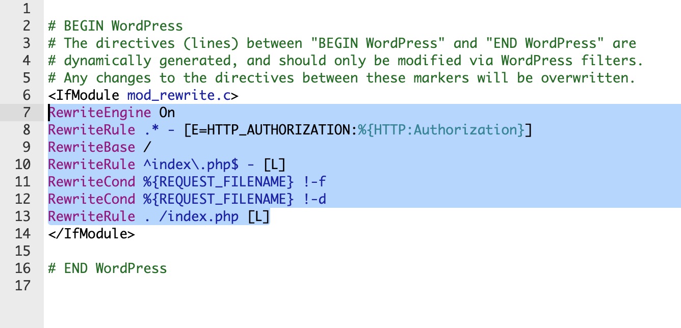
Now that you’re using a child theme, open the functions.php file inside the child theme folder. This is where you can safely paste in your code snippets—such as custom shortcodes, script enqueueing, or other PHP-based logic—without fear of losing them after updates.
Bonus Tip: Astra Pro Compatibility
If you’re using Astra Pro, don’t worry—your Pro features are handled by the Astra Pro plugin and will continue to work regardless of whether you’re using the parent or child theme. Just make sure the plugin remains activated.
Final Thoughts
If you’ve ever experienced your functions.php customizations disappearing, it’s likely due to a theme update. The permanent fix is simple: switch to a Child Theme. It takes just a few minutes and protects your customizations for the long haul.
Need help? Reach out via our contact page and we’d be happy to assist.


