If you’re a designer or developer looking to save time and improve your output, free templates can be your best friend. From HTML layouts to graphic templates, these sites offer ready-made resources that are easy to customize and adapt. Here are 5 of the best places to find high-quality free design templates—no strings attached.
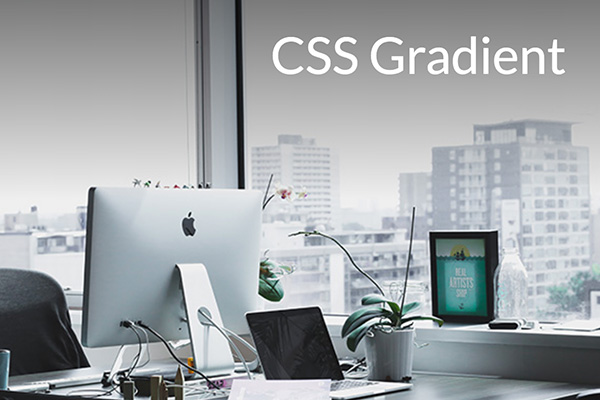
1. HTML5 UP
html5up.net provides fully responsive HTML/CSS templates built on clean code and sleek layouts. Ideal for landing pages, personal portfolios, and minimalist websites. Best of all? They’re free under a Creative Commons license.
2. Canva Templates
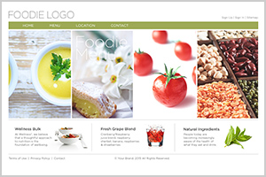
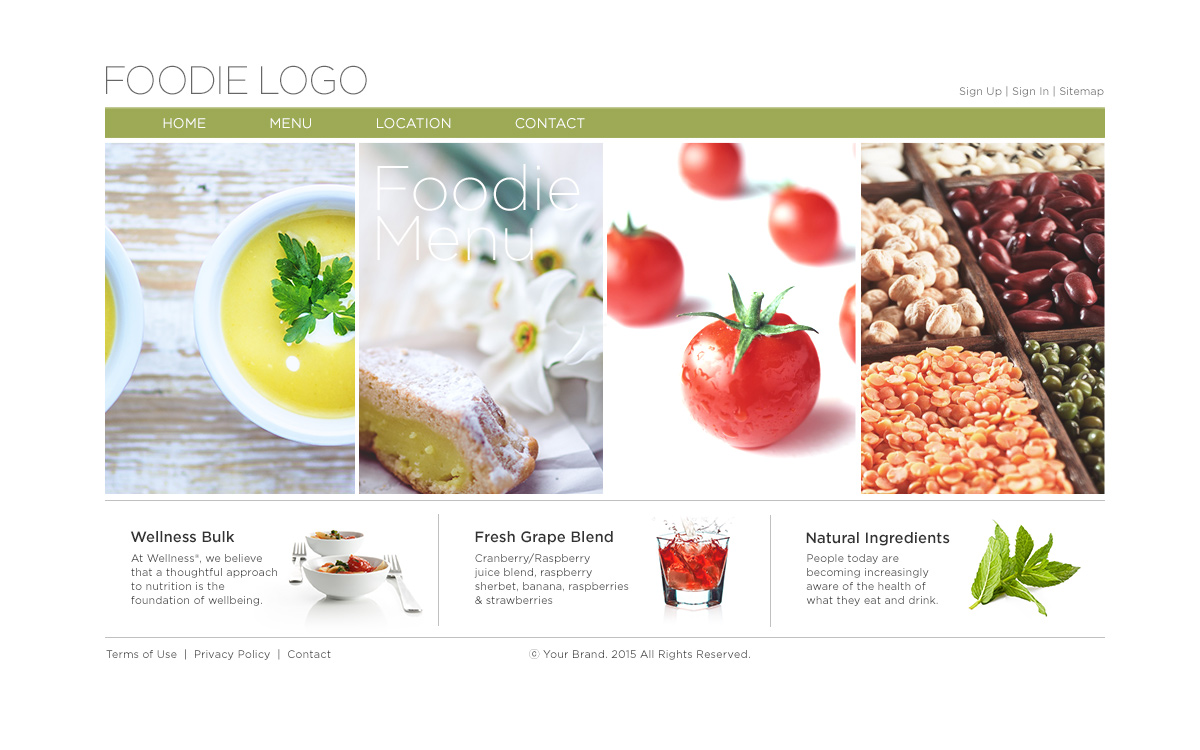
canva.com/templates offers thousands of free templates for Instagram posts, resumes, presentations, posters, and more. It’s great for quick mockups, mood boards, or when you need print-ready graphics in a pinch.
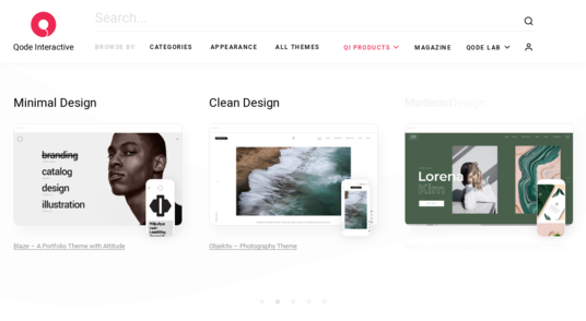
3. Figma Community
figma.com/community is a goldmine for UI designers. You’ll find wireframes, UI kits, dashboards, mobile layouts, and design systems—all created and shared by fellow designers. Simply duplicate and start editing.
4. Mixo.io – Landing Page Templates
mixo.io/templates offers free landing page templates powered by AI. Whether you’re launching a SaaS product, portfolio, or app, Mixo generates modern, mobile-ready templates you can edit in minutes.
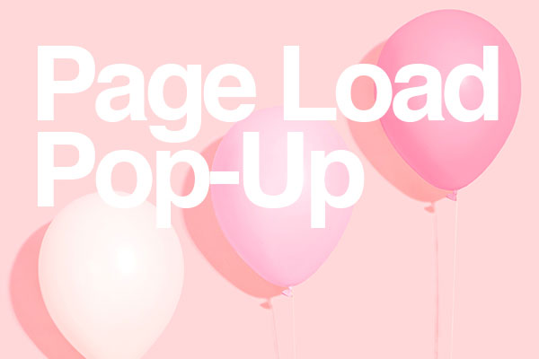
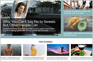
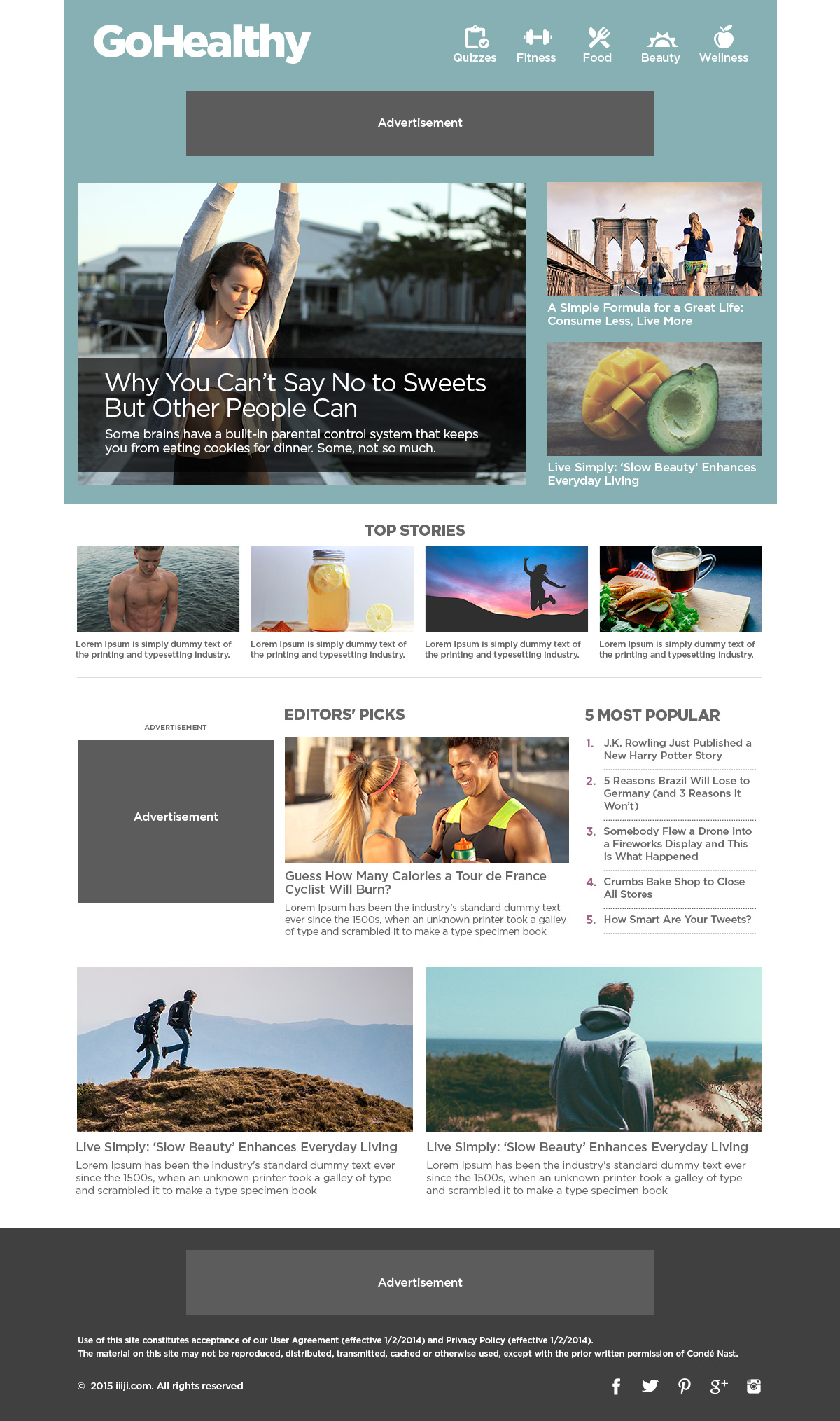
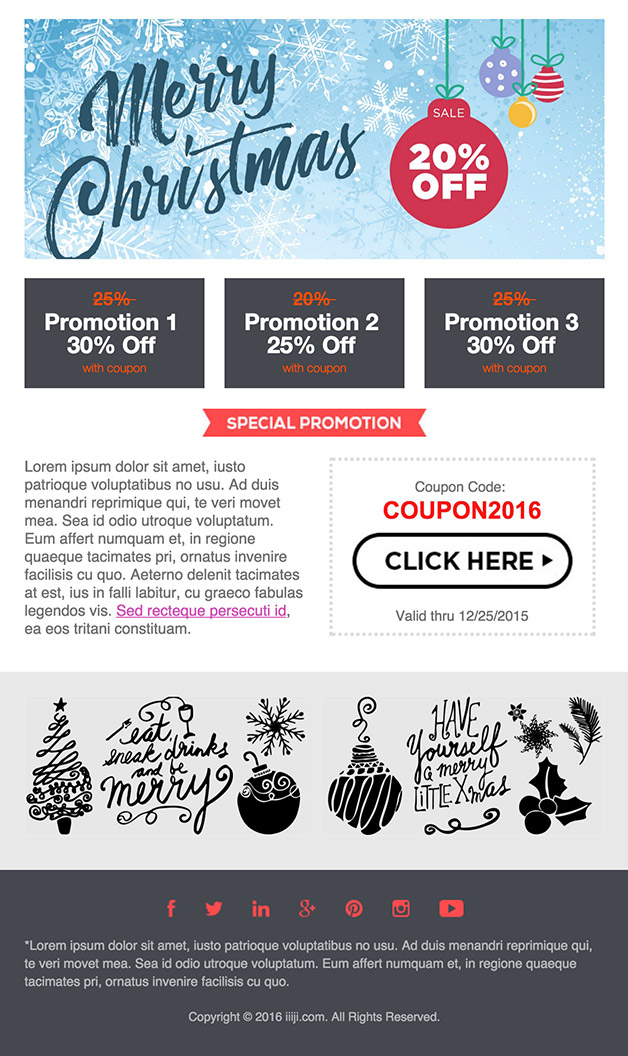
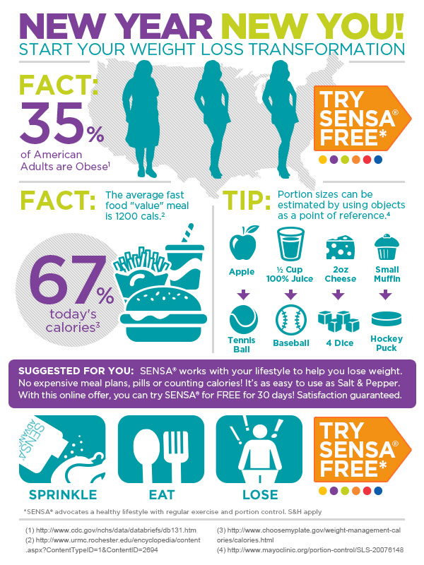
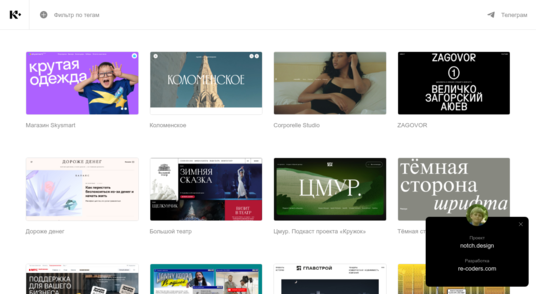
5. Identity Design – Freebies
blog.identitydesign.us/freebies is our curated library of free HTML templates, email layouts, posters, and more—crafted from real-world design projects. Ideal for freelance designers, agencies, and students looking for usable, customizable files.
Final Thoughts
Great design doesn’t always start from scratch. These free resources help you prototype faster, test ideas, and deliver polished results. Bookmark your favorites, tweak to match your brand, and build better—faster.
Explore more freebies at Identity Design Freebies