Category Archives: Bootstrap

Boostrap Change Animation

How to Change Bootstrap Carousel Slider Animation to Fade Out Effect or Remove the Sliding Effect

The sliding effect is the default animation for Bootstrap Carousel. Below code is how a general Bootstrap Carousel Slider would look like.

<div id="carousel" class="carousel slide" data-ride="carousel">
  <div class="carousel-inner">
    <div class="carousel-item active">
      <img src="https://blog.identitydesign.us/img/bg1.jpg">
    </div>
    <div class="carousel-item">
      <img src="https://blog.identitydesign.us/img/bg2.jpg">
    </div>
    <div class="carousel-item">
      <img src="https://blog.identitydesign.us/img/bg3.jpg">
    </div>
  </div>
</div>

Change Sliding Animation to a “Fade” Effect

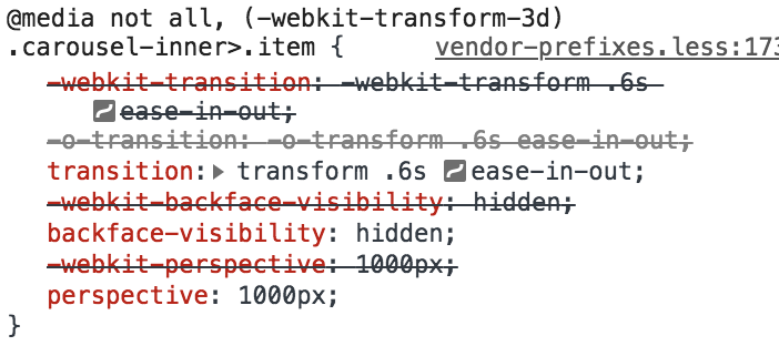
Add a class name, carousel-face right after slide. You can also add data-interval="3000" to control the speed of the animation. 1000 is 1 second, and 3000 is 3 seconds. You can replace ‘3000’ with your desired slider speed.

<div id="carousel" class="carousel slide carousel-fade" data-ride="carousel" data-interval="3000">

Remove the Sliding Effect Completely

You can completely remove the sliding effect on your carousel. Simply remove slide from the class of div.

<div id="carousel" class="carousel" data-ride="carousel">

Woocommerce Conflicts with Bootstrap 4 in WordPress

I can’t give up on either functionalities: Woocommerce and Bootstrap. A conflict occurs with the wonky looking layout when using Woocommerce and Bootstrap 4 together. See the breakdown when you are on the checkout page. Below a few CSS lines would resolve the wonkiness issue really quick. Now I can enjoy both!

CSS

.woocommerce .col-1, .woocommerce .col-2 { 
    max-width:none; 
}
.woocommerce-billing-fields .form-row, .woocommerce-shipping-fields .form-row,.woocommerce form .form-row { 
    display: block; 
}
.woocommerce .col2-set .col-1, .woocommerce-page .col2-set .col-1,.woocommerce .col2-set .col-2, .woocommerce-page .col2-set .col-2 { 
    max-width: unset; 
}
Bootstrap x Wordpress

Add Bootstrap to Your WordPress Website with a Plugin

There are a few ways to install Bootstrap 4 to your WordPress website for free. One of the popular choices is to activate a Bootstrap 4 pre-installed theme, but this can be little complicated or not efficient as you might want to use a woocommerce compatible theme or some themes of your favorite.

I recommend to use the “Simple Custom CSS and JS” plugin by Silkypress.com and add 3 lines to your html. By doing this, you have a freedom to choose any theme of your favorite and enjoy Bootstrap for free.

Let me show you how to add in steps.

  1. Go to the admin page of your WordPress website http://YOUR-DOMAIN.com/wp-admin
  2. Go to “Plugins” -> “Add New” -> search for “Simple Custom CSS and JS” plugin. Install the plugin and make it active.
  3. (You will see “Custom CSS & JS” on the sidebar), go to the plugin menu called Custom CSS & JS -> “Add Custom HTML”
  4. Name it as “Header”, check the radio buttons on Header and In Frontend.
  5. Add below CSS line into the code field and publish.
    <link rel="stylesheet" href="https://stackpath.bootstrapcdn.com/bootstrap/4.3.1/css/bootstrap.min.css" integrity="sha384-ggOyR0iXCbMQv3Xipma34MD+dH/1fQ784/j6cY/iJTQUOhcWr7x9JvoRxT2MZw1T" crossorigin="anonymous">
  6. Create another “Add Custom HTML” and name it “Footer”. Check the radio buttons on Footer and In Frontend
  7. Add below JS lines into the code field and publish.
    <script src="https://ajax.googleapis.com/ajax/libs/jquery/3.4.1/jquery.min.js"></script>
    <script src="https://stackpath.bootstrapcdn.com/bootstrap/4.3.1/js/bootstrap.min.js" integrity="sha384-JjSmVgyd0p3pXB1rRibZUAYoIIy6OrQ6VrjIEaFf/nJGzIxFDsf4x0xIM+B07jRM" crossorigin="anonymous"></script>

Now you are ready with Bootstrap 4 on your WordPress website. Enjoy!

Bootstrap Partial Collapse

Accordion Partial Collapse & Expand Demo Template for Bootstrap

Bootstrap has provided accordion “Collapse” JavaScript plugins for Bootstrap users, but has no explanation making the accordion partially expand and collapse.

Below is the demo/template to build your accordion partially expand and collapse within the given height. The HTML includes CDN (content delivery network) to connect Bootstrap/Jquery’s CSS and JavaScript files, so it’s ready to be used! Click to download below.

DEMO: How It Looks

HTML

<div class="accordion partialcollapse" id="partialcollapse">
  <div id="collapse-one" class="collapse" aria-labelledby="headingOne" data-parent="#partialcollapse">
    <h4>Accordion Title</h4>
    <p>Accordion content goes here</p>
  </div>
  <button class="btn btn-link" type="button" data-toggle="collapse" data-target="#collapse-one" aria-expanded="true" aria-controls="collapse-one"> </button>
</div>

CSS

.partialcollapse .collapse {
    display: block;
    height: 120px !important;
    overflow: hidden;
}
.partialcollapse .collapsing {
    height: inherit!important;
}
.partialcollapse .collapse.show {
    height: auto !important;
} 
.partialcollapse .collapse+button:after {
    content: '+ Show More';
}
.partialcollapse .show+button:after, .partialcollapse .collapsing+button:after {
    content: '- Show Less';
}
All in one HTML

All-in-one Bootstrap 4 / Jquery Responsive HTML Template

This is the All-in-one HTML Template to build your Bootstrap 4 (ver. 4.5.2) website. The HTML includes CDN (content delivery network) to connect Bootstrap/Jquery’s CSS and JavaScript files, so you literally need this single HTML to run.

HTML

<!DOCTYPE html>
<html lang="en">
<head>  
<meta charset="utf-8">
<meta http-equiv="X-UA-Compatible" content="IE=edge">
<meta name="viewport" content="width=device-width, initial-scale=1">
<meta name="robots" content="index, follow"/>
	
<!-- Bootstrap -->
<link href="https://stackpath.bootstrapcdn.com/bootstrap/4.5.2/css/bootstrap.min.css" rel="stylesheet">
    
<!-- HTML5 shim and Respond.js for IE8 support of HTML5 elements and media queries -->
<!-- WARNING: Respond.js doesn't work if you view the page via file:// -->
<!--[if lt IE 9]>
<script src="https://oss.maxcdn.com/html5shiv/3.7.2/html5shiv.min.js"></script>
<script src="https://oss.maxcdn.com/respond/1.4.2/respond.min.js"></script>
<![endif]-->
</head>
    
<body>
<p>Write your code here.</p>
 
<!-- jQuery (necessary for Bootstrap's JavaScript plugins) -->
<script src="https://code.jquery.com/jquery-3.5.1.js" integrity="sha256-QWo7LDvxbWT2tbbQ97B53yJnYU3WhH/C8ycbRAkjPDc=" crossorigin="anonymous"></script>
	
<!-- Include all compiled plugins (below), or include individual files as needed -->
<script src="https://stackpath.bootstrapcdn.com/bootstrap/4.5.2/js/bootstrap.min.js"></script>
 
</body>
</html>
Bootstrap TIme Interval

Bootstrap Uneven Column Heights Issue in Layout Grid System

Bootstrap columns could go wrong and look uneven when columns have different heights. Use float: left to clear out the float properties and to stack blocks to the closest side.

.col-lg-3:nth-child(5n) { clear: left; }

If you have multiple blocks (for instance, 4-column layout) use float: left pseudo-element to apply the class every 5th element 5n.

Load Page Pop-Up Thumb

CSS Only: Pop-up Modal Lightbox on Page Load

I’ve shared a way to add a pop-up or modal lightbox with CSS only on my earlier post, Easy Modal Lightbox Pop-Up. I’ve received many request how to make this modal pop up on page load instead of using a button. So, here’s how-to:

HTML

Copy the code below and paste into your HTML document.

<div id="modal-1" class="modal animate-opacity">
   <div class="modal-content">
      <div class="modal-inner">
         <span onclick="document.getElementById('modal-1').style.display='none'" class="modal-close">&times;</span>
         <h4>Modal Headline</h4>
         <p>Modal description goes here.</p>
      </div> 
   </div>
</div>

CSS

Copy the code below and paste into your CSS document.

.modal {
	z-index: 10;
	display: block;
	padding-top: 100px;
	position: fixed;
	left: 0;
	top: 0;
	width: 100%;
	height: 100%;
	overflow: auto;
	background-color: rgb(0,0,0);
	background-color: rgba(0,0,0,0.5)
}
.modal-content {
	margin: auto;
	background-color: #fff;
	position: relative;
	padding: 0;
	outline: 0;
	max-width: 600px
}
.modal-inner { padding: 20px 30px; }
.modal-close {
	-webkit-touch-callout: none;
	-webkit-user-select: none;
	-khtml-user-select: none;
	-moz-user-select: none;
	-ms-user-select: none;
	user-select: none;
	position: absolute;
	right: 0;
	top: 0;
	background: #ccc;
	padding: 6px 10px;
}
.animate-opacity { animation: opac 0.8s }@keyframes opac{from{opacity:0} to{opacity:1}}

.animate-opacity is optional as it’s the animated effect when modal opens.

You can tweak the animation time. It’s currently 0.8 seconds opac 0.8s , but change the timing as your need.

Thumbnail Reviews

Star Rating Symbol Icons Show Broken or Square Boxes on Woocommerce Review

Very strange? I just made the reviews functionality active on my WordPress Woocommerce website, and I see the icons are broken with square boxes (some says “SSSSS”). There should be some CSS conflicts where the icon fonts were not properly loaded. So, I’ve came up overwriting some CSS styling including a new font-family to the page, and it’s working!

p.stars a:before, p.stars a:hover, p.stars a:visited, p.stars a:focus, p.stars a:hover~a:before, p.stars:hover a:before, p.stars.selected a:not(.active):before, p.stars.selected a.active:before, p.stars.selected a.active~a:before {
    font-family: 'star';
    content: '';
    line-height: 1.4 !important;
}
Storefront Thumb

Remove ‘Built with Storefront & WooCommerce’ with CSS lines on WordPress Storefront Theme

Woocommerce offers one of a greatest E-Commerce template themes for free called, “Storefront“. From the Nav to checkout process, all required functionality in order to run an E-Commerce are ready for you to download and activate. But, one little thing is bugging at the bottom of the page, “Built with Storefront & WooCommerce.” line, however, it’s possible to get it out with a few lines of CSS.

Store front copyright

Remove and replace copyright information on Storefront theme

footer .site-infos { display:none; } 				
footer .footer-widgets { border: 0 !important;	}	
footer .footer-widgets::after {  content: "© ADD THIS FOR YOUR COPYRIGHT INFO" }

Add a Copyright Text / Info Using CSS on WordPress Websites

Let’s don’t bother spending hours to look for footer.php or widgets in WordPress to add your Copyright line on the footer of website. Here’s one easy method to add using CSS.
copyright

Add copyright text / info with CSS for WordPress/Bootstrap websites

footer > div:before {
    content: "© Copyright (YEAR). All rights reserved.";
    font-size: 14px;
    color: #777;
    text-align: center;
    display: block;
    margin: 20px auto;
}

How to Remove “Bootstrap WordPress Theme” on WP Bootstrap Starter Template

Get Custom Phone Case Now!

WP Bootstrap Starter Theme is one of a popular templates you can get it for free in WordPress. It’s nice with light weighted built in Boostrap 4 framework so it’s ready to use just by having the theme itself.

You can pretty much edit the entire website including the header and footer except for removing the copyright text very bottom of the page saying, “Bootstrap WordPress Theme”.

Screen Shot 2019-05-31 at 4.59.42 PM

Here’s a way to make it disappear by adding a CSS line. Let me show you how to do this in a minute!

Remove “Bootstrap WordPress Theme” text on the footer

  1. Go to the Admin website -> Appearance -> Customize -> Additional CSS
  2. Copy the CSS code below and paste on the CSS window.
  3. Save!
footer .sep, footer .credits {
    display:none;
}
Absolute centering

CSS / HTML: Make Absolute Center (Vertical & Horizontal)

For some reasons, making an article absolute center was pretty tricky with HTML.

Horizontal centering is mostly done by text-align:center or margin:auto tags in css. Vertical alignment has to do with positions or vertical-align:middle, and many times an image or other elements are not centering correctly.

Try this below, this is one easy way making your content elements absolute center in vertical and horizontal.

DEMO: Vertical & Horizontal Absolute Centering

Hello.
Your centered content is here!

CSS

Copy the code below and paste into your CSS document.

body {
	display: flex;
	justify-content: center;
	align-items: center;
        text-align:center;
}

Easy and fantastic!

Pop up thumbnail

CSS Only: Easy Modal Lightbox Pop-up (Animated)

Now you can add pop-ups or modal lightbox with CSS only (and really minor single line of JavaScript) on your html, wordpress or bootstrap website, so don’t be afraid.

DEMO: CSS Modal Lightbox

HTML

Copy the code below and paste into your HTML document.

<button onclick="document.getElementById('modal-1').style.display='block'">Click Here</button>

<div id="modal-1" class="modal animate-opacity">
   <div class="modal-content">
      <div class="modal-inner">
         <span onclick="document.getElementById('modal-1').style.display='none'" class="modal-close">&times;</span>
         <h4>Modal Headline</h4>
         <p>Modal description goes here.</p>
      </div> 
   </div>
</div>

You can add multiple modals. Copy the entire codes and replace all modal-1 into modal-2 and modal-3

CSS

Copy the code below and paste into your CSS document.

.modal {
	z-index: 10;
	display: none;
	padding-top: 100px;
	position: fixed;
	left: 0;
	top: 0;
	width: 100%;
	height: 100%;
	overflow: auto;
	background-color: rgb(0,0,0);
	background-color: rgba(0,0,0,0.5)
}
.modal-content {
	margin: auto;
	background-color: #fff;
	position: relative;
	padding: 0;
	outline: 0;
	max-width: 600px
}
.modal-inner { padding: 20px 30px; }
.modal-close {
	-webkit-touch-callout: none;
	-webkit-user-select: none;
	-khtml-user-select: none;
	-moz-user-select: none;
	-ms-user-select: none;
	user-select: none;
	position: absolute;
	right: 0;
	top: 0;
	background: #ccc;
	padding: 6px 10px;
}
.animate-opacity { animation: opac 0.8s }@keyframes opac{from{opacity:0} to{opacity:1}}

These 4 classes would do the job, and the last class, .animate-opacity is the animated effect when modal opens (so it’s optional).

You can tweak the animation time slower or faster by changing the speed time. It’s currently 0.8 seconds, opac 0.8s, but change it as you need it. Have fun!

How to Make Bootstrap Nav Top Level Menu Clickable With Dropdowns

Your bootstrap top level menu will not be clickable when you add more menus under it like sub-navs or dropdowns. There are some How-Tos of adding a snippet of JavaScript or php online to make it work, but it seems to be risky and complicated.

Here’s a simple solution changing 1 word from your Bootstrap HTML file:

<li class="dropdown" data-dropdown="dropdown"> 
   <a href="URL" class="dropdown-toggle" data-hover="dropdown">X</a> 
   <ul class="sub-menu dropdown-menu"> 
      <li></li> 
   </ul> 
</li>

Change data-toggle to data-hover. Done!

If you use “Bootstrap-basic” theme on your WordPress, look for a file called, “BootstrapBasicMyWalkerNavMenu.php” under “inc” folder. Find the code “data-toggle” and replace with “data-hover“. Isn’t this super easy!?

How Create a HTML/CSS Ribbon. Simple and Light (None Jpg/Png Image)

Here’s a simple html/css line that could generate a ribbon background with text.

DEMO: CSS Ribbon for Your Website

My Ribbon

HTML

Copy the code below and paste into your HTML document.

<div class="ribbon">
    <span class="ribbon-text">My Ribbon</span>
</div>

CSS

Copy the code below and paste into your CSS document.

.ribbon {
    position: relative;
    background: blue;
    text-align: center;
    z-index: 1;
    width: 240px;
    height: 52px;
    margin: 0 auto;
}
.ribbon-text {
    position: relative;
    display: block;
    font-size: 2em;
    color: white;
 }
.ribbon:before {
    content: '';
    border: 26px solid blue;
    border-left-color: transparent;
    border-left-width: 14px;
    position: absolute;
    top: 0;
    left: -20px;
}
.ribbon:after {
    content: '';
    border: 26px solid blue;
    border-right-color: transparent;
    border-right-width: 21px;
    position: absolute;
    top: 0;
    right: -27px;
}

You can tweak around with different colors and size of the ribbon. Have fun!

Bootstrap TIme Interval

How to Change Bootstrap Carousel Slider Transition Speed Time Interval

Commemorate an important event!

Bootstrap is one of the most popular, powerful and light HTML/CSS/JavaScript Responsive framework for developers, and it’s also available for WordPress as well. To use the Bootstrap carousel slider below is setting to change slider time interval (transition speed of slider images). Don’t get confused with changing the core JavaScript or CSS files.

Bootstrap Carousel Slider Time Interval Setting

Default Bootstrap Carousel Slider Snippet

<div id="myCarousel" class="carousel slide" data-ride="carousel"> 
 <!-- Indicators -->
 <ol class="carousel-indicators">
 <li data-target="#myCarousel" data-slide-to="0" class="active"></li>
 <li data-target="#myCarousel" data-slide-to="1"></li>
 <li data-target="#myCarousel" data-slide-to="2"></li>
 <li data-target="#myCarousel" data-slide-to="3"></li>
 </ol>
 
 <!-- Wrapper for slides -->
 <div class="carousel-inner" role="listbox">
 <div class="item active"> <img src="img_chania.jpg" alt="Chania"> </div>
 <div class="item"> <img src="img_chania2.jpg" alt="Chania"> </div>
 <div class="item"> <img src="img_flower.jpg" alt="Flower"> </div>
 <div class="item"> <img src="img_flower2.jpg" alt="Flower"> </div>
 </div>
 
 <!-- Left and right controls --> 
 <a class="left carousel-control" href="#myCarousel" role="button" data-slide="prev"> 
 <span class="glyphicon glyphicon-chevron-left" aria-hidden="true"></span>
 <span class="sr-only">Previous</span>
 </a>
 <a class="right carousel-control" href="#myCarousel" role="button" data-slide="next">
 <span class="glyphicon glyphicon-chevron-right" aria-hidden="true"></span>
 <span class="sr-only">Next</span>
 </a> 
</div>

Add the ‘data-interval’ on the first line of code

<div id="myCarousel" class="carousel slide" data-ride="carousel" data-interval="3000"></div>

1000 is 1 second, and 3000 is 3 seconds. You can replace ‘3000’ with your desired slider speed.

Change Slider Animation Time in CSS

The default slider animation time, which is called ‘transition’ property, is 0.6 seconds. You can also slow down or make the animation time faster in css.
Animation time

On you own css, add the followeing lines if you want to change the animation time. To make the animation slower, increase the time by 1.2 seconds for example:

.carousel-inner>.item {
    -webkit-transition: -webkit-transform 1.2s ease-in-out !important;
    -o-transition: -o-transform 1.2s ease-in-out !important;
    transition: transform 1.2s ease-in-out !important;
}