Category Archives: design

Chains

CSS: How to Make an Anchor Not Clickable in HTML

When building web pages, there are times you might want an anchor link (<a>) to be visible but non-functional. Perhaps you’re still working on that section of your website, or the link is for decorative purposes only. Whatever the reason, making an anchor not clickable is simple with a few CSS rules.

The Code Snippet

Let’s start with a quick code snippet that makes an anchor tag unclickable:

<a href="#" class="inactive-link">Unclickable Link</a>

Then, in your CSS, add the following styles:

.inactive-link {
    pointer-events: none;
    cursor: default;
}

A Use Case for This Approach

Let’s say you have a navigation menu, but one of the pages is under construction. You still want the link to be visible for design consistency, but don’t want users to interact with it. Here’s an example:

<nav>
  <ul>
    <li><a href="/home">Home</a></li>
    <li><a href="/about">About</a></li>
    <li><a href="#" class="inactive-link">Contact (Coming Soon)</a></li>
  </ul>
</nav>

Conclusion

With just a couple of lines of CSS, you can make any anchor tag unclickable. It’s a quick and effective way to manage inactive or placeholder links on your website. Try this technique next time you need a link to be visible but non-functional!

zoom plastic letter toy

CSS Only Animation: Zoom on Hover

In today’s quick tip, we’ll dive into creating a dynamic ‘zoom on hover’ effect that adds an interactive touch to images on your web pages. By incorporating the provided CSS, your images will elegantly scale up when hovered over. This effect, achieved with minimal code, is a fantastic way to enhance your website’s visual appeal and engage your visitors.

DEMO: Zoom on Hover

HTML

<img class="zoom-in" src="YOUR-IMAGE-PATH"/>

CSS

.zoom-in { transition:transform .2s; }
.zoom-in:hover { transform: scale(1.2); }
Abstract background with swap icon

CSS Only Animation: Image Swapping on Hover (Logo Swap)

Explore how to enhance your website’s interactivity with this simple guide on implementing a logo or image swap effect upon mouse hover. Ideal for web designers and developers, this tutorial includes step-by-step instructions, complete with HTML and CSS code snippets, to seamlessly integrate this dynamic visual cue into your web project. Perfect for adding that extra flair to logos or images on your site, learn how to create a more engaging user experience with ease.

DEMO: Swapping Logo/Image on Hover of Mouse

my-first-logomy-second-logo

HTML

<div class="swap">
	<a href="https://wedesignorange.com">
		<img class="main" src="YOUR-MAIN-IMAGE" />
		<img class="hover" src="YOUR-SWAPPING-IMAGE" />
	</a>
</div>

CSS

.swap { height: 200px; width: 200px; position: relative; }
.swap img {
	position: absolute;
	top: 0;
	right: 0;
	left: 0;
	bottom: 0;
	transition: opacity .9s;
	width: 100%;
	height: 100%;
	object-fit: contain;
}
.swap img.hover, .swap:hover img.main { opacity:0; }
.swap img.hover:hover { opacity:1; }
image scrolling

CSS Animation: Image Scrolling on Hover

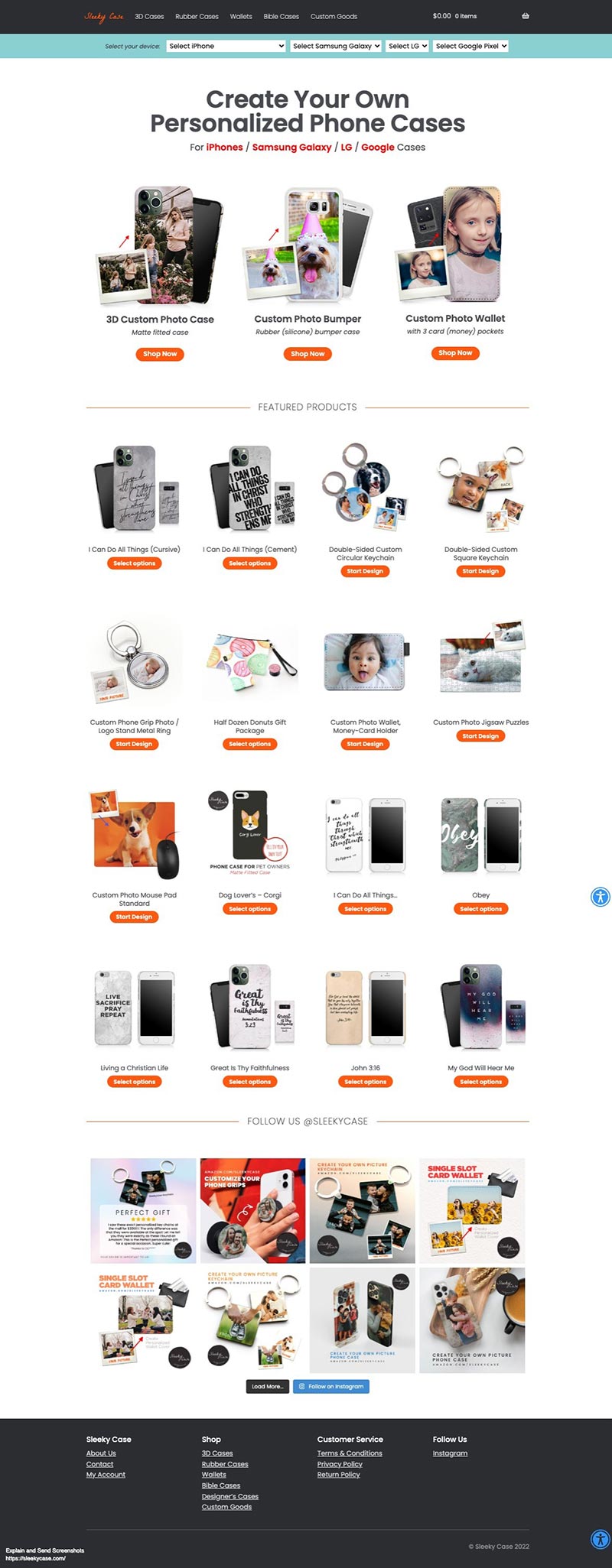
In the ever-evolving world of web design, adding interactive and visually appealing elements to your website can greatly enhance the user experience. One exciting way to achieve this is by learning how to create an image scrolling effect on hover with CSS animation. With just a few lines of code, you can transform a static image into an engaging and dynamic component that draws the viewer’s attention. So, let’s dive in and discover how to make your website come to life with CSS image scrolling on hover!

DEMO: Mouse over to see the scrolling animation

sleekycase.com website

HTML

<div class="container"> 
	<img src="YOUR-IMAGE"> 
</div>

CSS

img { 
	object-fit: cover;
	object-position: top;
	transition: ease-in-out 4s;
	width: 450px;
	height: 300px;
}
img:hover {
	object-position: bottom;
}
Hamburger Menu Icon

HTML-CSS-JS: Simple Hamburger Menu Expandable

“How to create an expandable hamburger menu?”

DEMO: How It Looks

HTML

<header class="header">
  <div class="header__menu menu">
    <div class="menu__icon"> <span></span> </div>
    <nav class="menu__body">
      <ul class="menu__list">
        <li> <a data-goto="#home" href="" class="menu__link">Home</a></li>
        <li> <a data-goto="#section-1" href="" class="menu__link">Section 1</a></li>
        <li> <a data-goto="#section-2" href="" class="menu__link">Section 2</a></li>
        <li> <a data-goto="#section-3" href="" class="menu__link">Section 3</a></li>
      </ul>
    </nav>
  </div>
</header>

CSS

body {
	background-color: black; font-family:sans-serif; 
}
header a {
	color: #111 !important;
	text-decoration: none!important;
	font-weight: 200;
	font-size: 2.2rem;
	line-height: 1.2;
	display: block;
}
.header__menu {
	position: fixed;
	top: 34px;
	right: 30px;
	z-index: 10;
}
.menu__icon {
	z-index: 5;
	display: block;
	position: relative;
	width: 50px;
	height: 22px;
	cursor: pointer;
}
.menu__icon span, .menu__icon::before, .menu__icon::after {
	left: 0;
	position: absolute;
	height: 20%;
	width: 100%;
	transition: all 0.3s ease 0s;
	background-color: white;
}
.menu__icon::before, .menu__icon::after {
	content: '';
}
.menu__icon::before {
	top: 0;
}
.menu__icon::after {
	bottom: 0;
}
.menu__icon span {
	top: 50%;
	transform: scale(1) translate(0, -50%);
}
.menu__icon._active span {
	transform: scale(0) translate(0, -50%);
}
.menu__icon._active::before {
	top: 50%;
	transform: rotate(-45deg) translate(0, -50%);
}
.menu__icon._active::after {
	bottom: 50%;
	transform: rotate(45deg) translate(0, 50%);
}
.menu__body {
	position: fixed;
	top: 0;
	right: -99%;
	width: 34%;
	height: 100%;
	background-color: rgba(255, 255, 255, 0.8);
	padding: 100px 30px 30px 30px;
	transition: right 0.3s ease 0s;
	overflow: auto;
}
.menu__body._active {
	right: 0;
}
.menu__list > li {
	flex-wrap: wrap;
	margin-bottom: 30px;
}
.menu__body ul {
	padding-left: 1rem;
	list-style: none;
}

JavaScript

Link the below external Javascript into the bottom of your HTML.

<script type="text/javascript" src="https://blog.identitydesign.us/js/hamburger.js"></script>

With having the hamburger menu on your navigation, your website could look more sophisticated and clean.

Kebab Display Menu Template

Freebies: Kebab Kabob Display Menu Template (PSD)

Kebab Display Menu Template

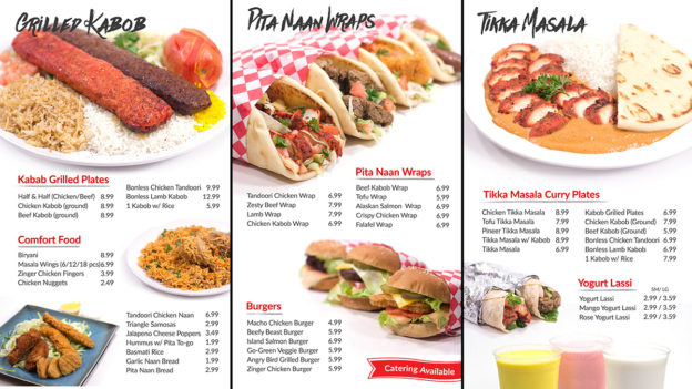
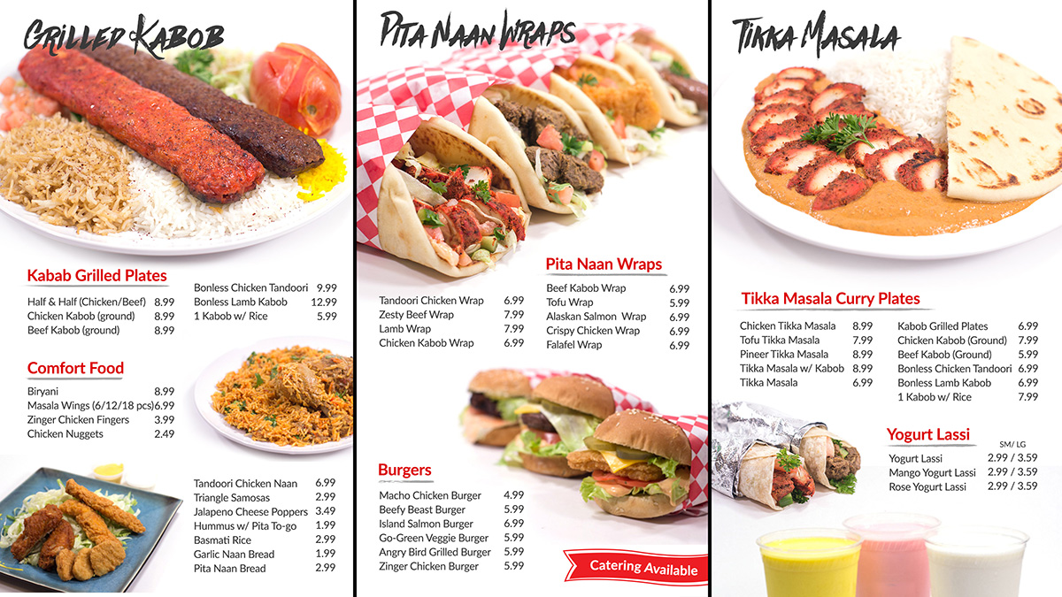
The “Kebab” or “Kabob” Mediterranean food display menu template in Photoshop (PSD) by Identity Design is designed in high resolution and ready to use. It’s layered in PSD and available for a free download.

Terms
  • All Identity Design Freebies can be used for both personal and commercial use.
  • You may not redistribute or resell Identity Design Freebies in any shape or form.
bookmark

Web Developer / Designer Bookmarks

Get Inspired!

Behance

behance

Trendy portfolios. Showcase. Adobe.

dribbble

dribbble

World designers. Top creatives.

awwwards

awwards

Awards of design.

Cyrillic Design

cyrillic

Awards of design.

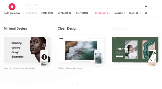
Qode Interactive

qode interactive

High quality WordPress Templates.

Pinterest

pinterest

Image sharing. Social Media.

Design Resources

Unsplash

unsplash

Freely-usable photo library.

Freepik

freepik

Powerful vector library.

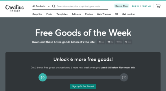
Creative Market

Creative Market

6 free goods. Every week.

Pixelbuddha

pixelbuddha

Free & premium resources.

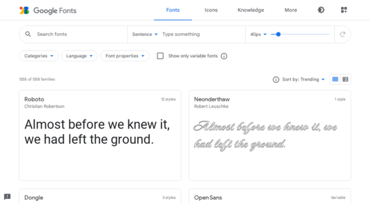
Google Fonts

Google Fonts

Free web fonts. Downloadable.

Material Icons

Material Icons

Free web icons from Google.

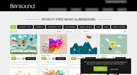
Bensound

bensound

Royalty free music.

Tools

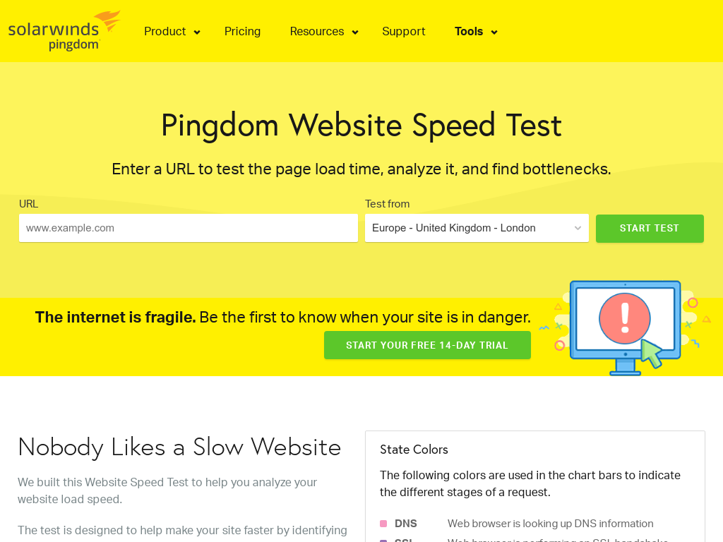
Pingdom Website Speed Test

pingdom

Analyze web. Speed test.

Whois Lookup

Whois Lookup

Find IP. DNS

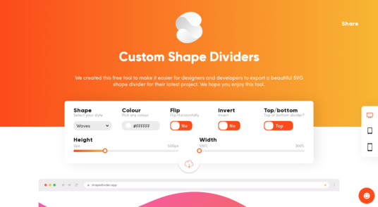
Custom Shape Dividers

customshape

Custom dividers for web. SVG

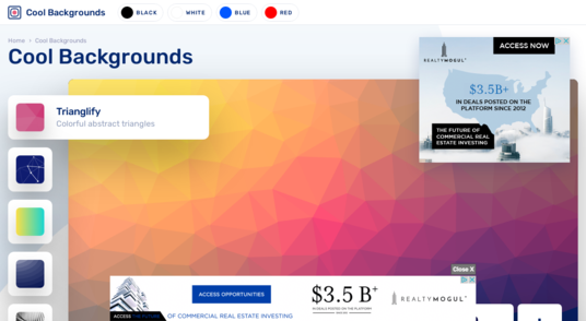
Cool Backgrounds

coolbackgrounds

Customize backgrounds in PNG. Abstract. Lines. Gradient.

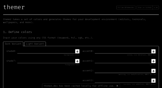
themer

themer

Generates colors

Web Fundamentals

Web Fundamentals

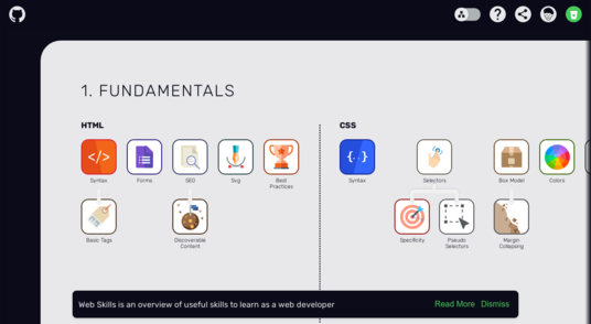
Web skills learning. HTML, CSS, JavaScript and browser

Car Cover Website Template

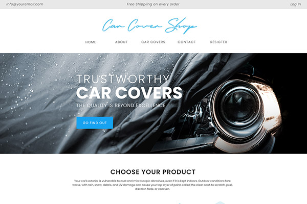
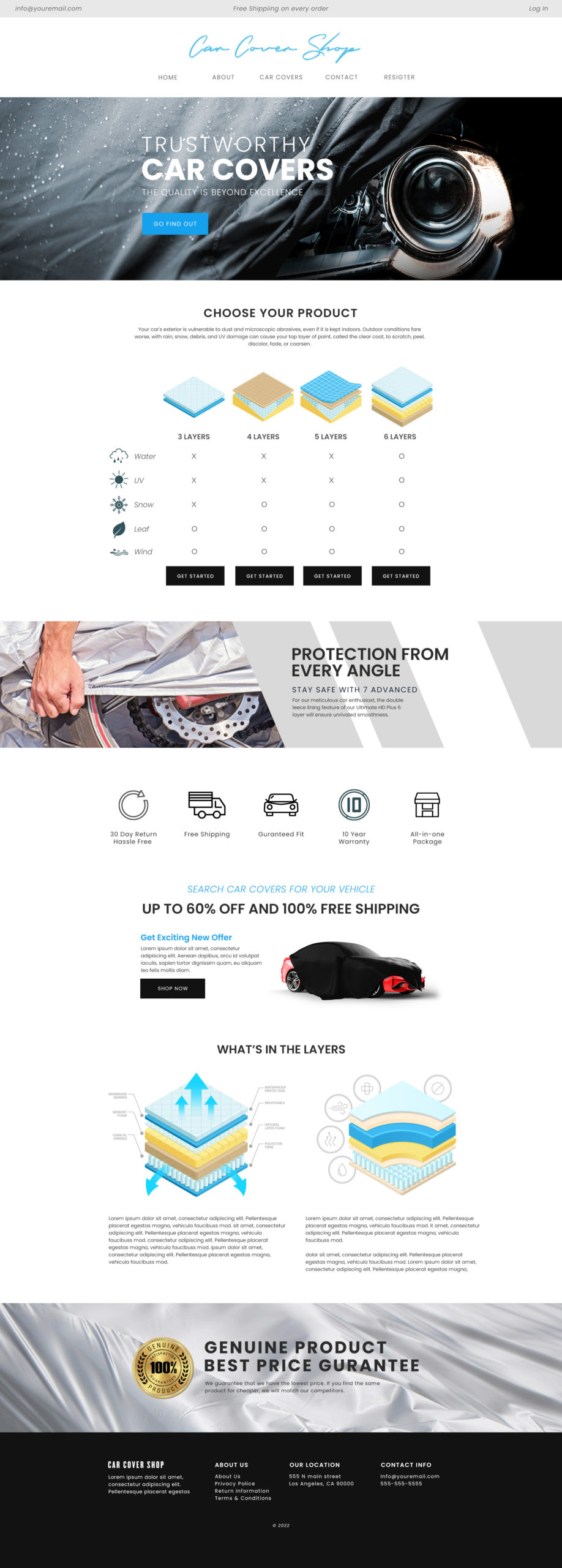
Freebies: Car Cover Website Mock Up Template (PSD)

Car Cover Website Template

The Car Cover Website Design mockup in Photoshop (PSD) by Identity Design is designed in high quality 2400 pixel in width. This clean & sophisticated design is ready to use on your own design before it’s cut up in HTML. It’s layered in PSD and available for a free download.

Terms
  • All Identity Design Freebies can be used for both personal and commercial use.
  • You may not redistribute or resell Identity Design Freebies in any shape or form.

How to Change the Order of Artboards on Adobe Illustrator

Adobe Illustrator can create multiple paged PDF using multiple artboards. If you need to rearrange the order of pages, here is how-to.

Artboards are like Canvas in Adobe Photoshop.

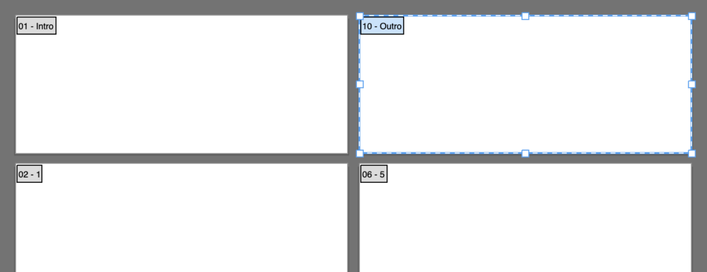
Artboards

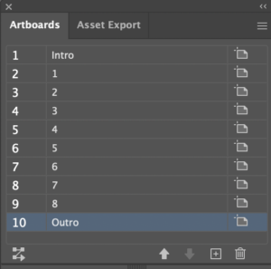
The two-digit number starting on the left of each artboard is the order of the content in PDF. To change the order of artboards, open up the Artboard Palette and drag layers as you want.

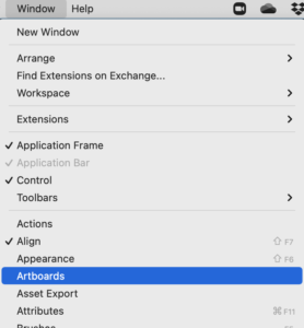
1 Open -> Window (on top menu bar) -> choose Artboards

how to open Artboard

2 Change the Order of Artboards by Dragging the Layers

Artboard Palette

Just need to save your document in PDF.