Here’s a very simple way to size your table width with a few lines of CSS instead of giving inline values to it. This method is much easier for creating responsive tables.
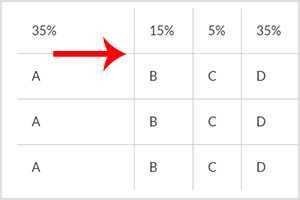
DEMO: How It Looks
| 35% | 15% | 5% | 35% | 10% |
| A | B | C | D | E |
| A | B | C | D | E |
| A | B | C | D | E |
CSS
Copy the code below and paste into your CSS document.
table tr td { padding:20px }
table td:nth-child(1) { width:35%; }
table td:nth-child(2) { width:15%; }
table td:nth-child(3) { width:5%; }
table td:nth-child(4) { width:35%; }
table td:nth-child(5) { width:10%; }
HTML
Copy the code below and paste into your HTML document.
<table class="table" border="0" cellspacing="0" cellpadding="0">
  <tr>
    <td>35%</td>
    <td>15%</td>
    <td>5%</td>
    <td>35%</td>
    <td>10%</td>
  </tr>
  <tr>
    <td>A</td>
    <td>B</td>
    <td>C</td>
    <td>D</td>
    <td>E</td>
  </tr>
  <tr>
    <td>A</td>
    <td>B</td>
    <td>C</td>
    <td>D</td>
    <td>E</td>
  </tr>
  <tr>
    <td>A</td>
    <td>B</td>
    <td>C</td>
    <td>D</td>
    <td>E</td>
  </tr>
</table>
You can copy both CSS and HTML codes to your file and tweak around as you like!