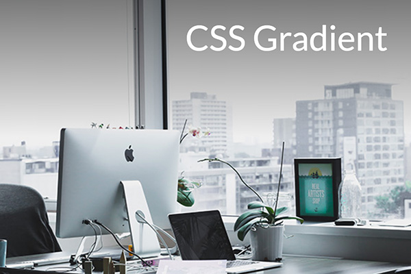
Sometimes the text or caption is not legible on an image depends on the color contrast between the foreground element and the background. I used to edit my image to be more darker or lighter to make the HTML text stand out and readable to users, but well, here’s must easier solution with lines of CSS!
Original
CSS Gradient
HTML
Copy the code below and paste into your HTML document.
<div class="hero-outer">
    <div class="hero-inner">
        <p>CSS Gradient</p>
    </div>
</div>
CSS
Copy the code below and paste into your CSS document.
.hero-outer { position:relative; }
.hero-inner::after {
    content: '';
    position: absolute;
    top: 0;
    left: 0;
    width: 100%;
    height: 50%;
    background-image: linear-gradient(to bottom, #000, transparent);
    opacity: 0.5;
}
.hero-inner {
    background: url('https://blog.identitydesign.us/wp-content/uploads/2019/10/300x200-gradient-1.jpg');
    width:100%;
    height: 400px;
    background-size:cover;
}
.hero-inner p {
    color:#fff;
    position:relative;
    font-size: 50px !important;
    padding-right: 40px;
    text-align: right;
    top: 20px;
    z-index: 1;
}
